
Welcome to “The Healing Power of Color” 2025 Invitational Exhibition!
For Maximum Enjoyment View this Online Exhibition on the Largest Monitor You Have!
Take Your Time! Enjoy Viewing the Art and Reading the Artists’ Statements!
The artists in this exhibition approach their use of color to express their deepest feelings, share their beliefs, convey meaningful messages, and transform viewers and themselves on many levels. Savor each work of art and let it speak to you visually and viscerally. Return often and share this with your loved ones, friends and associates.
This exhibition includes artists who are members of one or more of our online galleries — Manhattan Arts International and The Healing Power of ART & ARTISTS — and/or from our Art Review series. You will also view art on this theme by several historical master artists who paved the way for many contemporary artists through their use of color and as pioneers in art movements. For a complete list of all exhibiting artists visit this page.
The Importance of “The Healing Power of Color” 2025 Exhibition
April 20 – June 20, 2025
The power of color has been documented in many scientific studies to bring healing energy when you are ailing. It is a fact that color has the ability to soothe your frazzled nerves when you feel agitated, restore your energy, motivate and empower you to take action when you are in a state of lethargy, provide hope during challenging times, and so much more.
At the end of this presentation you will find some of the many healing attributes of colors from the primary and secondary spectrum and links to more of our exhibitions devoted to the healing power of color.
A Special Tribute to Artist Joanne Turney
This exhibition is dedicated to the memory of my dear friend, Joanne Turney, an award-winning abstract artist, author, and humanitarian who died on April 6, 2025. Joanne possessed a strong belief in the healing power of art. More than 25 years ago when Joanne was diagnosed with breast cancer she created “The Art of Healing”, a series of 13 paintings depicting the emotional stages of her battle and recovery. She later donated the paintings to a healing facility to bring healing and hope to others. She also continued to create art and wrote a book The Art of Joyful Aging.
~ Renee Phillips, Curator, Founder & Director, Manhattan Arts International and The Healing Power of ART & ARTISTS
All rights reserved. Do not reproduce images without the artists’ permission.
Please also visit the artists’ websites to view more of their art.
Contact them directly regarding making a purchase.
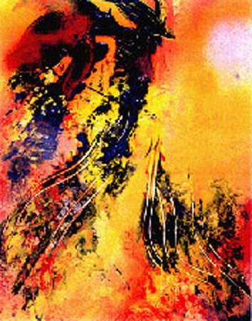
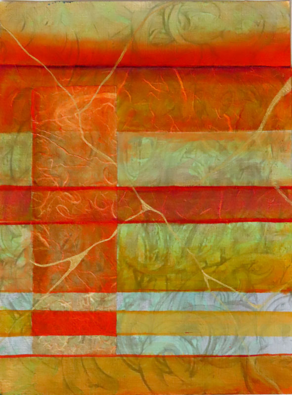
Michael Amrose
Color, form, shape, and line become my subject speaking to the viewer with a new, independent voice. I consider the semiotic, psychological, and cultural impact on the viewer of specific colors, shapes, lines, and form used when designing my subject. The application of unorthodox photographic and lighting techniques to capture my subject, which incorporates various art types, enables me to move beyond representational images and allows me to explore photography’s capacity to create an abstract experience unencumbered by reality. amroseartphotography.com
Barbara Brown

My inspiration comes from the forest where I live, so I paint mostly in greens and browns. I never tire of these colours. With their infinite variety I’m always finding new combinations and new exciting challenges in how to best to bring forward the foreground while creating the rich depth of the background to draw you in deep into the woods. The greens and browns of nature are so very healing. They settle the soul. They ground us. barbarabrownart.com
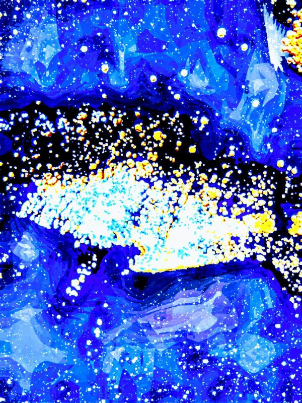
Rohit Shah
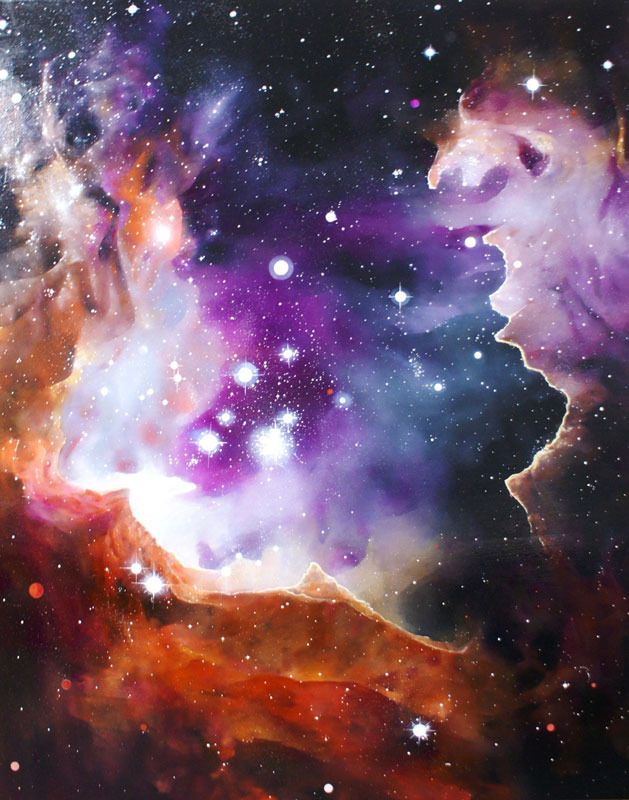
These are colors of my dream of a young Nebula. As an artist, I am captivated by clouds packed with intriguing features — vibrant and surreal colors only experienced in dreams. I enjoy painting the cosmos — our universe. For me it is a visual tour through an infinite spectrum of colors. Color is life. Color is poetry. Color is a beauty of chemistry. Color is the single most important element in the universe. rohitshahdesign.com
Bren Sibilsky
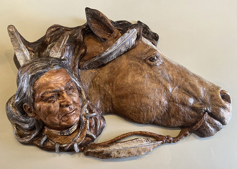
Sculptures start out as clay, some made into molds to take on different mediums. The last journey to finish sculpture is color. Color choices change the energy of sculpture. The shadows and depth of the 3-D form can be adjusted to new intensities from high brilliance to chromatic harmonies. Most people do not realize that much of the classical Greek and Roman works of sculpture in history were not white, but were once painted with powerful colors of their day. brensculpture.com
Anne Morrison Rabe

My eye is always drawn to color – and the uplift to the spirit that our beautiful colorful world can bring. I find joy knowing that my photography resonates with others, bringing a touch of beauty and introspection into their lives. In a world filled with noise, my images whisper quiet truths, inviting viewers to pause, reflect, and find peace in the beauty that surrounds us. annemorrisonrabe.photography
Georgia O’Keeffe
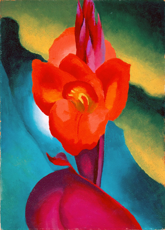
I found I could say things with colors that I could not say in any other way, things for which I had no words… I know I can not paint a flower. I can not paint the sun on the desert on a bright summer morning but maybe in terms of paint color I can convey to you my experience of the flower or the experience that makes the flower of significance to me at that particular time… All the earth colors of the painter’s palette are out there in the many miles of badlands. The light Naples yellow through the ochres – orange and red and purple earth – even the soft earth greens.
Sandra Belitza-Vazquez
The combination of colors and textures of objects attracts my attention and invites me to raise my camera and capture the essence of those objects. How colors flow together or complement one another and highlight textures intrigues me. Observing and exploring my surroundings makes me slow down my often-hectic pace. I am more grounded when I give myself time to contemplate and appreciate what nature offers and what man uses to express feelings and states of mind. sbvaz.com
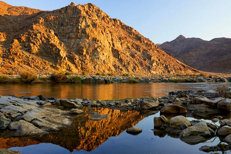
Peter N. Van Giesen
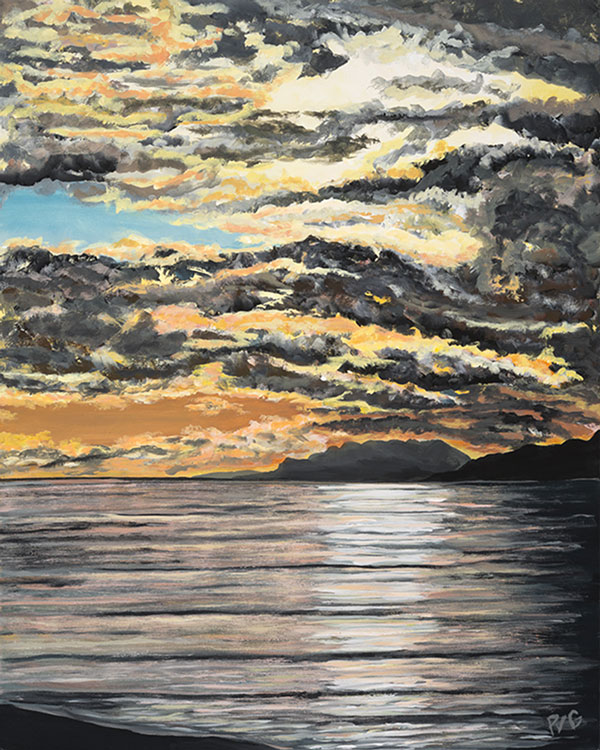
“Evening Promise” captures the end of a beautiful day… a majestic seascape bathed in the warm and dynamic hues of a sunset. A striking interplay of colors and textures. The after storm clouds danced in an expressive, swirling vibrancy of oranges, yellows, and blues. Storms do pass, this I know, yet they have a powerful grip on my soul. The golden lining is they create the most beautiful memories, once past. The sea kisses the horizon creating a sense of infinite, interconnected sensation of tranquility, easily countering the atmospheric dynamics. peternvangiesen.com
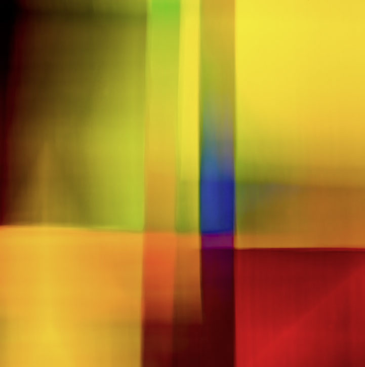
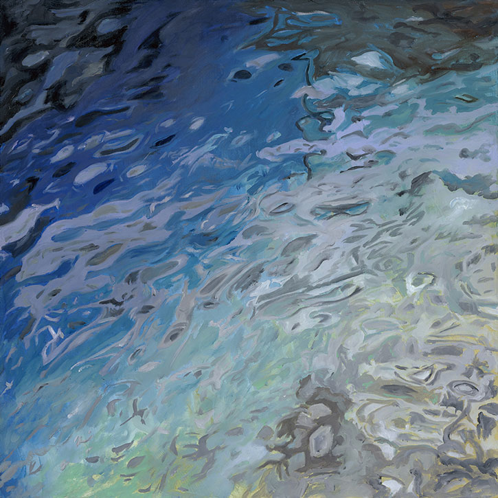
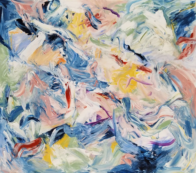
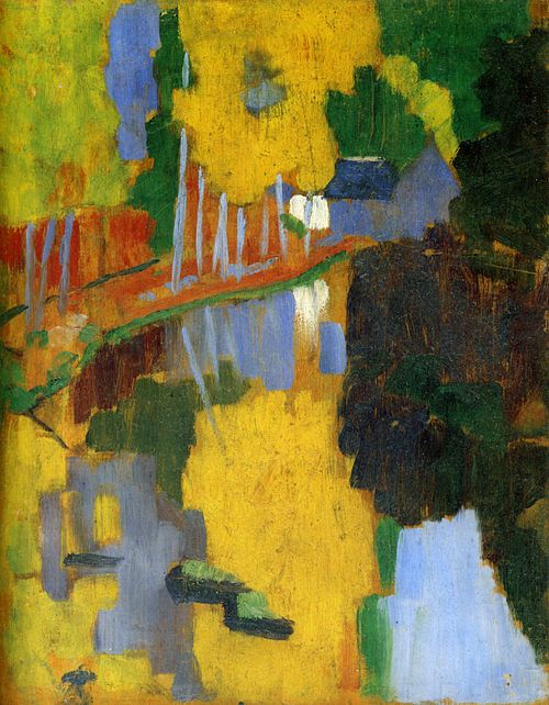
Nancy Reyner
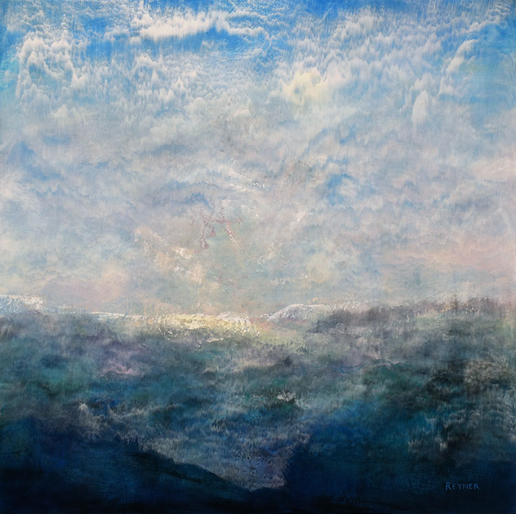
I chose this image of water and an overall blue palette, to add to its emotional and spiritual appeal. Healing can occur through a variety of ways yet mostly is an inside job. Color evokes emotion, and paired with design and form, may invite a viewer towards insights from a higher or more spiritual point of view. This is my intent for all my work. nancyreyner.com
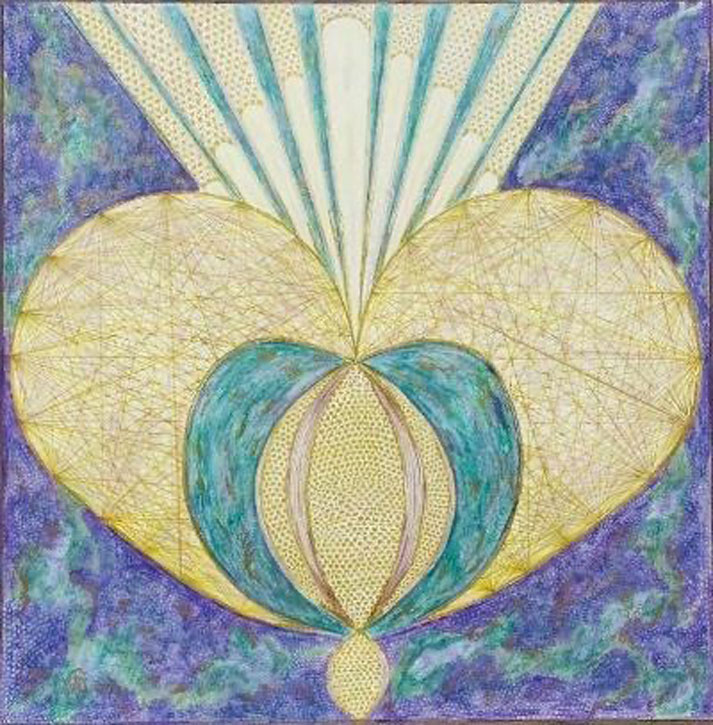
Rajul Shah
My work is a fusion of the spiritual teachings of the Chakras and Japanese Art of Kintsugi. The Chakras (energy centers) align the nervous system with aspects of the human psyche. Using the aura color of each chakra, I paint meditative abstract expressions of color. Kintsugi is metaphor for the human journey. Like cracks in pottery mended with gold, mending scars keeps our chakras in balance, leading to free flow of energy in our body for well-being. rajulshahart.com
Rachael Reuter
Rooted in the belief that colour carries an energetic imprint, my art seeks to evoke healing, balance and spiritual awakening. At its core lies an interplay of frequencies – vibrations that resonate with the mind, body and spirit. By viewing such artworks, shifts in the personal energy fields can occur, releasing blockages and reconnecting the viewer to their authentic selves. My artworks offer a sanctuary — a portal to inner peace and holistic well-being. rachaelreuter.com
Wassily Kandinsky
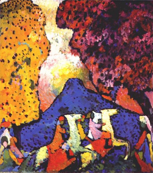
Kandinsky was part of “Der Blaue Reiter” (The Blue Rider) Group.
He believed the color blue was the most spiritual color.
I applied streaks and blobs of colors onto the canvas with a palette knife, and I made them sing with all the intensity I could… Generally speaking, color directly influences the soul. Color is the keyboard, the eyes are the hammers, the soul is the piano with many strings. The artist is the hand that plays, touching one key or another purposively, to cause vibrations in the soul… Color hides a power still unknown but real, which acts on every part of the human body… The deeper the blue becomes, the more strongly it calls man towards the infinite, awakening in him a desire for the pure and, finally, for the supernatural…
Sandy Iseli

Color is a powerful tool which can influence moods, emotions and even behaviors. Colors influence the mind and body and, therefore, can be very healing. They have the power to cheer, invigorate, soothe or relax. I tend to paint with strong colors. Their rich pigments jump out to me and fill me with joy. The colors I use on any painting reflects the emotional mood I am in. I paint with colors that just make me feel good! sandyiseli.com
Nancy Staub Laughlin
My assemblages immerse the viewer into my world of color, light and dimension. I create these works by combining the elements: the phenomena of precipitation and and paralleling moments of spring to come. Color is the spring lure to awaken the viewer to the imminent seasonal change. These compelling compositions are the culmination of many carefully executed steps that define my unique creative process. nancystaublaughlin.com
Sandra Duran Wilson

Color is a frequency that is typically perceived by the eyes and also a vibration that can be sensed by the body. Color evokes sounds and music, often used in healing meditations. Walking in an old growth forest or viewing Monet’s Waterlilies can make healing frequencies felt. I use color in my art to evoke a wide variety of sensations. sandraduranwilson.com
Poul Nielsen

My current work continues my infatuation with prairie light and its unique colouration. Furthermore, I am concerned with an expansive space rather than compressed, which of course connects with my prairie environment. I love working high keyed, saturated hues and my colouration is influenced by the exceptional colour of the Indigenous Blackfeet and the Peruvian, Quechuan mountain people, where I spend my winters. I believe colour has an inherent healing power, which we are only beginning to understand. psnielsen.com
Joan Metcalf
My paintings of large-scale florals, gardens, landscapes and seascapes all reflect my fascination with the lush, natural beauty of the Pacific Northwest. I try to portray nature at its most colorful and dramatic. I use composition metal leaf which is 88% copper and 12% zinc for the gold color and the silver color is 100% aluminum. As the viewer moves past my paintings the metal leaf shimmers and reflects colors that constantly change with different lighting conditions. joanmetcalf.com
Henri Matisse
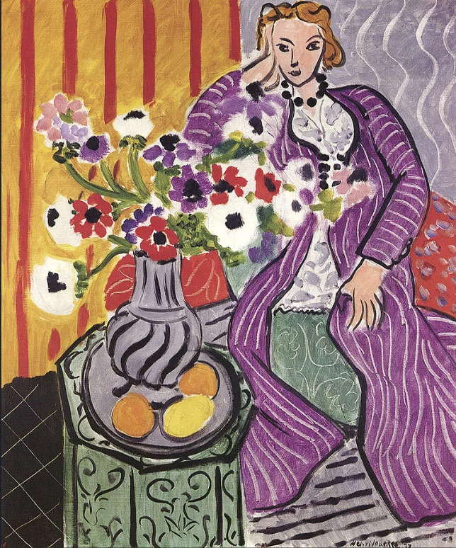
Matisse was one of the pioneers of “Fauvism”. Artists in this movement used pure, brilliant colour often applied straight from the paint tubes. Matisse’s use of flat areas of bold colors and patterns enhances space and volume.
Colour helps to express light, not the physical phenomenon, but the only light that really exists, that in the artist’s brain. The chief aim of color should be to serve expression as well as possible… Purer colors… have in themselves, independently of the objects they serve to express, a significant action on the feelings of those who look at them… A thimbleful of red is redder than a bucketful… With color one obtains an energy that seems to stem from witchcraft.
Steevie Jane Parks
Color is by far the most important element in my work as a visual artist. I often visualize colors that feel healing or empowering to me as an individual and use them in my paintings to heal and empower others. I find that specific combinations of colors can also have profound healing effects on both myself and my viewers. steeviejaneparksfineart.lyric.store
Janice Phelps Williams
Color inspires me at every turn. My memory holds various shades of blue: a vibrant Northern Michigan sky, natural springs where manatees winter, and ice found in Glacier Bay National Park. Who can forget the bluest eyes they’ve ever seen or standing under a tree when sunlight shines through the leaves, creating a mosaic of greens and yellows? For me, line and color are not tools to represent something. They are the something. janicephelpswilliams.com
Heather Stivison
As an intuitive painter, I find the use of color to be an intensely personal experience. There is something meditative and soothing about working with an analogous palette. Like certain music, the visual experience of colors in harmony washes over you and brings spiritual peace in difficult times like these. heatherstivisonart.com
Guimond
My vibrant palette—infused with purples, blues, and sunlit oranges—invites contemplation and calm. Each painting is a breath, an inner clearing. Through the structure of shapes and the intensity of color, I seek to soothe, to awaken, to open a space of light. For both myself and the viewer, color becomes a refuge, a healing energy, a way to re-enchant the world. guimondstudio.com
Debora Levy
Color is a power, it changes reactions, and is an expression of the soul. Color can speak, move our emotions, and touch our soul. It tells stories, awakens memories, and fills the world with energy. It creates harmony, contrast, and movement, shaping how we feel and see. Through color, we connect, dream, and bring emotions to life. deboralevyart.com
Sonia Delaunay

Sonia Delaunay was one of the founders of “Orphism”, also known as “Simultaneism”. This important art movement focused on pure abstraction and bright colors.
I live color, I love it and I know it… I have lived my art, I have always changed everything around me. One who knows how to appreciate color relationships, the influence of one color with another, their contrasts and dissonances, is promised an infinite variety of images.
Tracy Ellyn
As an artist, my focus is on color, unintentionally, but as a synesthete. Color affects me, and my viewers I am told, on several levels. Physically, color brings down blood pressure and breathing rates. Emotionally, color enhances mood, with warm colors uplifting and moving, while cool colors provide inwardly spiraling peace. Soulfully, color is the life force, whether for art, music, dance, writing. I’ve been a synesthete my entire life, and I hope to bring that across in my work to others who connect with it. tracyellyn-recentworks.com
Peter Dooley
For me, color’s fascinating aspect lies in its ability to alter perceived hue through neighbouring colors, creating an intriguing effect that catches the eye and adds depth. In composition, colors vary in weight, with white being the heaviest. I strive to use the weight of colour in my work to create a balanced calming effect. Utilizing complementary or split complementary colors produces a captivating contrast that enhances visual impact. These attributes are crucial for maximizing color’s healing effects. galleryafrique.com
Karen H. Salup
Color and I have been acquainted through my entire career. Color for me is everything. The sun rising in the east and setting in the west, is mezmerising for me. Color comes to me in landscapes, the trees changing with the seasons, the flowers that bloom, and a simple orchard. Visiting museums and seeing colorful works by other artists are creative ideas and influences for me. I have also been told that many of the colors I wear can been reflected in my paintings. karenhs.com
Shirley Wallitsch
Nature is my primary muse, influencig both the vibrant colors and intricate textures that define my work. From the delicate shades of flowers to the rich hues of minerals, each clor carries its own emotional resonance. By exploring their interplay, I create artwork that evolves with each stroke and layer. wallitschart.com
Dick and Rosanne
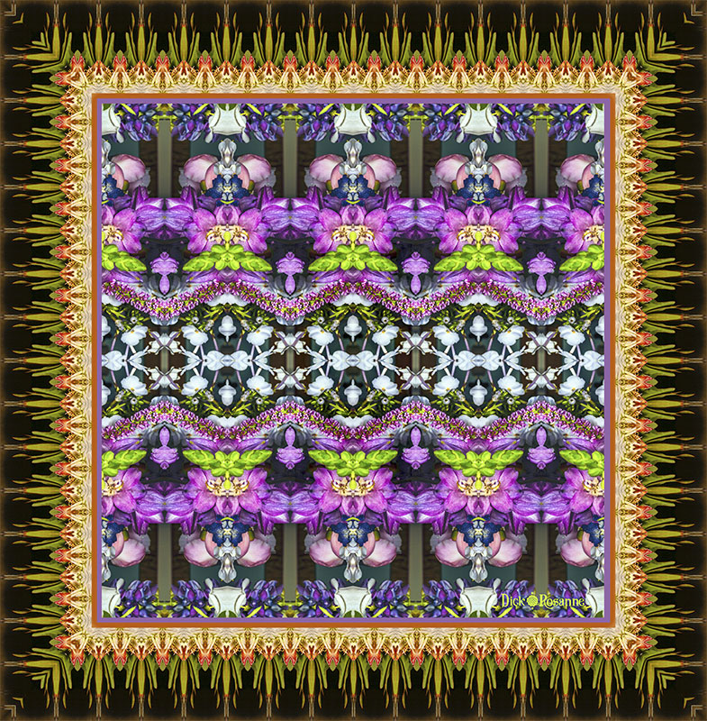
Color is a universal language that has the power to calm, delight, heal, and soothe. As artists, we immerse ourselves in nature’s vibrant tapestry, studying its hues and textures. We create mandala-like images of our photos amplifying the inherent colors to evoke the profound sense of peace and harmony of nature’s own artistry. Our ultimate aspiration is for our work to serve as a conduit, allowing others to immerse themselves in the healing and transformative power of color. dickandrosanne.com
Claude Monet
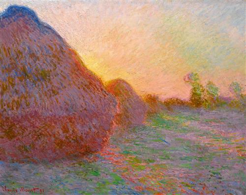
Color is my day long obsession, joy and torment… When you go out to paint, try to forget what objects you have before you, a tree, a house, a field or whatever. Merely think here is a little square of blue, here an oblong of pink, here a streak of yellow, and paint it just as it looks to you, the exact color and shape.
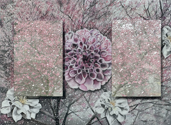
Mary Chaplin
When I set about depicting my garden, I recreate a space of happiness, of life, where each color, each shape, each line expresses a palpable emotion, a lived emotion. I invite you to dive into a world of color, where the canvas becomes the reflection of my deepest emotions. Each gesture, each brushstroke is a dance with light, an exploration of shapes and colors that unfold on canvases of various formats. mary-chaplin.com
Roopa Dudley

This painting is about my marriage to the man of my dreams and an imminent divorce on the horizon. Some moments I feel that if given a choice, I would prefer death over this quagmire that I find myself in. I incorporated black and white design elements which is part of my signature style. The color yellow in this painting symbolizes renewal and courage. roopadudley.com
Tanis Bula
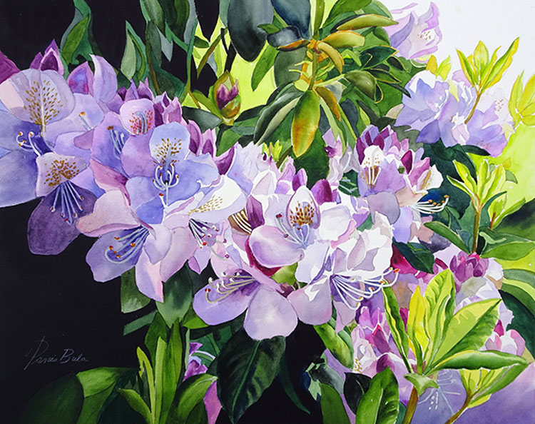
The use of color in my paintings I hope will add joy and excitement. The complementary colors such as red violet and yellow greens balance warm and cool tones. Using contrasting colors in a painting create feeling of excitement with different colors combinations evoke different responses. tanisbula.com
Barbara Rachko
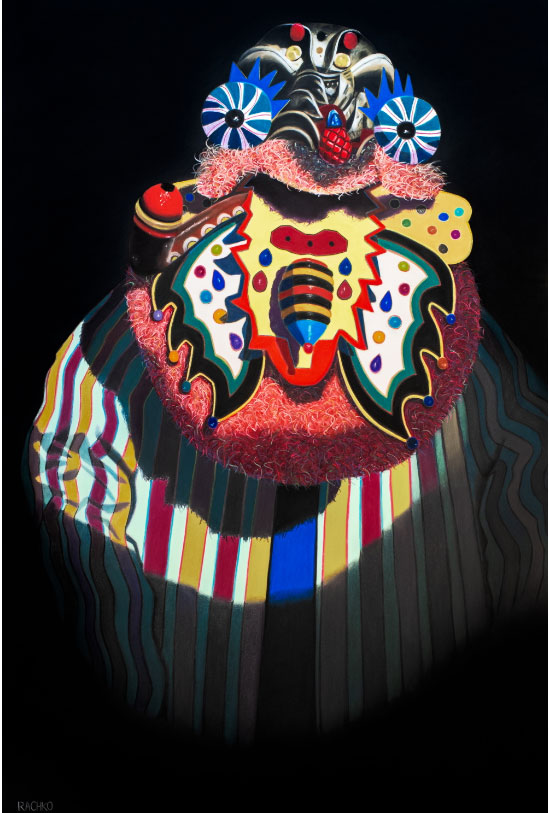
For more than 30 years I have been devoted to soft pastel on sandpaper. I believe my ‘science of color’ is unique. The acid-free sandpaper allows me to slowly and meticulously build up 25 to 30 layers of pastel. In addition to the thousands of pastels that I have to choose from, I make new colors directly on the paper. Regardless of size, each pastel painting takes hundreds of hours and about four months to complete. barbararachko.art
Judy Hatlen
My artistic journey is fueled by a deep empathy for nature and a desire to foster a connection between people and the environment. Color plays a vital role in my artistic expression, serving not only as a visual element but also as a healing force. The hues I choose are intentional, aiming to evoke emotions and foster a sense of tranquility. I believe that the right colors can uplift the spirit and create a space for reflection and connection. judysartco.com
Pablo Picasso
Colors, like features, follow the changes of the emotions. Some painters transform the sun into a yellow spot, others transform a yellow spot into the sun. Why do two colors, put one next to the other, sing? Can one really explain this? No. Just as one can never learn how to paint… They’ll sell you thousands of greens. Veronese green and emerald green and cadmium green and any sort of green you like; but that particular green, never.
Elliot Appel
Color transforms the sometimes drab, everyday world of city life into something vibrant, exciting, new and enriching. I try to capture details of everyday life that people may not notice or take for granted as they rush from place to place. elliotappelpaints.com
Mary Manning
Color makes me sing inside, and that inner music makes me heal. I love to apply colors in rich juicy brushstrokes, so people can feel the same healing energy. I grew up with Red Rock Canyon in my backyard. The bold and brilliant red sandstone drew me on hikes, archaeology field trips, photo shoots, and painting sessions. marymanningnewwest.com
Nimi Trehan
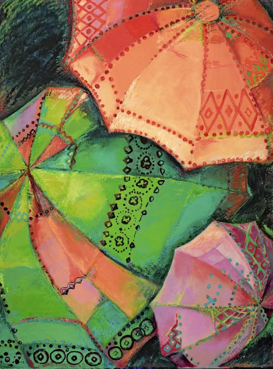
The word color is practically synonymous with India. While strolling through Dilli Haat—a vibrant and unexpected oasis tucked amid New Delhi’s dust and bustle—I came across a group of strikingly unusual umbrellas that immediately caught my eye. Their rich hues and intricate patterns, crafted by humble, untrained village artisans who have preserved this parasol-making tradition through generations, compelled me to capture the moment and reinterpret it through my own artistic lens. nimitrehan.com
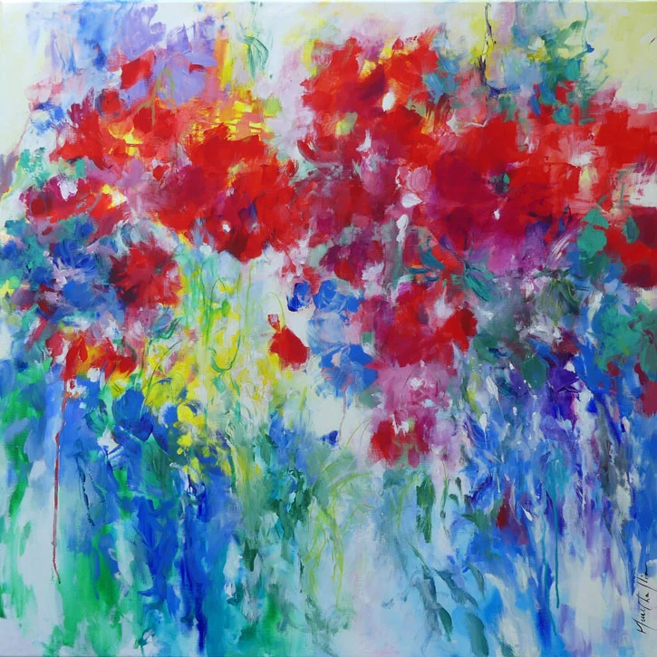
Yvonne Welman
My paintings are based on ideas, social issues and general opinions about art, gender equality and overall generalisation in roll patterns. The symbolic use of the color red in this painting in the flowers and figure conveys power in different pespectives. I want the viewer to bring their own thoughts and emotions to interpret my work. I also want to inspire the viewer to pose the ‘why’ question. yvonne-welman.com
Marc Chagall
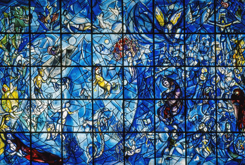
Marc Chagall’s stated, “All colors are the friends of their neighbors and the lovers of their opposites”. In other words, “Friends” are the analogous colors — those that are side by side on a 12-part color wheel. The “lovers” Chagall refers to are complementary colors — those hues that are directly opposite each other on the color wheel.
Vasu Tolia

I consider color as a universal language of healing and emotional connection. Every hue I use is intentional — chosen to evoke calm, joy, or introspection. Whether layering warm earth tones or exploring cool blues, color allows me to create immersive experiences that speak to both the heart and mind. It is through color that I express resilience, beauty, and the cycles of nature — inviting viewers to find their own sense of peace and wonder within each piece. vasutolia.art
Alison Thomas
I strive in my art to produce “nature in vivid color, simply stated”. My work stimulates the viewer to explore more deeply the way beauty is seen and experienced by removing much of the detail and leaving only the essence. serenityscenes.com
Teri Leigh Teed
The colors of each photograph in the Eleanor’s Dream series are unique and healing paintings of Light. The canvas is the dark night sky over the Nantahala Forest, and the frequencies or energies of each moment in time create the colors and the stories. Each color and each symbol brings the story to life. The meanings are universal and interpreted by each viewer. Each photograph starts as a dark canvas, and like a painting evolves as the Light reveals the Divine messages of Love. terileighteed.com
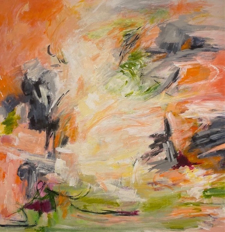
Jan Kirstein Rigor
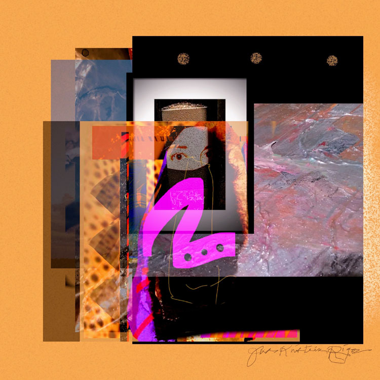
I use color to capture the contradicting energy and serenity of an unpredictable natural external world as well as internal psychological landscape. “Self Portrait” is an image showing my current feelings relating to the continued assault on human rights, especially women’s rights that I am witnessing daily in our own country, the United States. The shroud over my face expresses grief and a feeling of repression, the bright orange and fuschia curve evoke the spirit to overcome tyranny and oppression upon witnessing the dismemberment of human rights all around me. janiskirsteinrigor.com
Corina Ioana
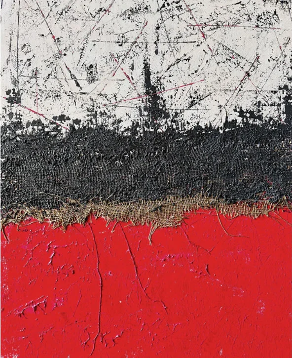
Color is my gateway to expression. I select the hues, responding to the emotions and energy I experience in the moment. Music sets the rhythm of my process, guiding the flow of colors. “Red Organic Pulse” embodies a dynamic interplay of raw energy and textured form. The rich red tones evoke a sense of vitality and intensity, split by a striking black-painted stripe of jute and one in its natural, unrefined hue. The other half of the piece softens the intensity with beige and white tones, yet crisscross lines in matching red add a rhythmic pulse, bringing cohesion to the work. Black stripes introduce contrast, grounding the piece with a balance of organic warmth and energetic movement. corinafoto.com
Vincent van Gogh
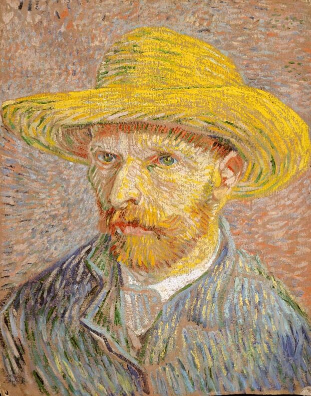
Van Gogh earned a reputation as the father of “Expressionism”. He inspired artists in this movement with his use of pure, bright colors, emphatic brushwork, and contrasting color combinations.
Instead of trying to reproduce exactly what I see before me, I make more arbitrary use of colour to express myself more forcefully. To express the love of two lovers by the marriage of two complementary colours. To express the thought of a brow by the radiance of a light tone against a dark background. To express hope by some star. Someone’s passion by the radiance of the setting sun… There is no blue without yellow and without orange…. The painter of the future will be a colourist the like of which has never yet been seen.
Carole Claude T.
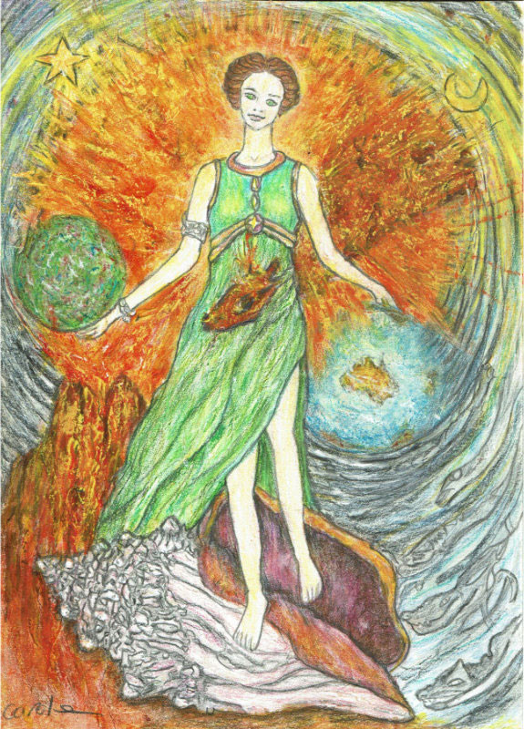
The sacral chakra’s vibrant orange and the solar plexus’ intense yellow blend well together to produce the explosions of inner light or sunlight that emanate from many of my subjects. Combined with shades of earthy brown, these grounding colours also enliven the rocks and cliffs that feature in many of my drawings. Grey adds neutral balance to What-Is. And, of course, gradient shades of greens and blues act as calming balms. They allow the space to breathe, expand and reset. caroleclaude.art
Julia Underwood
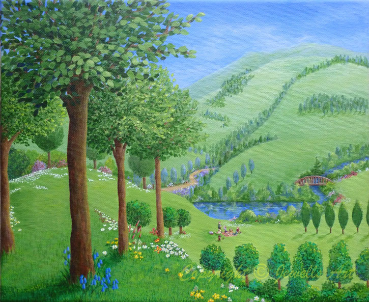
“Path of Life” is a painting of a walk into a lush green landscape and the future. In Feng Shui art with green is recommended to place in your home or office for Wealth, Blessings & Well-Being. It symbolizes nature, fresh energy and growth. It provides nurturing for the family and promotes prosperity and abundance. A green path is an excellent choice if you are unclear which direction you want to go in but you know you want to move forward unhindered. jewellsart.co.uk
Monique J. DuFour
Color plays a major role in all my art. I choose my palette based on my mood and/or what I would like to convey to the viewer. It’s about higher vibrations, positive energy and endless possibilities. When the viewer is able to “feel” the colors, and how it might relate to some part of their life, I hope that they will embrace a new day. moniquejdufourhealingart.com
Eva Breitfuss

The colors in my artwork are an expression of energy, depth, and transformation. Each color carries a vibrational quality that resonates within, creating a space of healing and expansion for both myself and the viewer. The purple energy in “From Nothing” can symbolize spiritual cleansing in that it removes all sorts of blockages and allows you to find some form of wisdom and peace. It’s related to the crown chakra. breitfusseva.space
Paul Gauguin
Color! What a deep and mysterious language. It is the language of dreams… Color which, like music, is a matter of vibrations, reaches what is most general and therefore most indefinable in nature: its inner power… If you see a tree as blue, then make it blue…
Marianne Goldyn
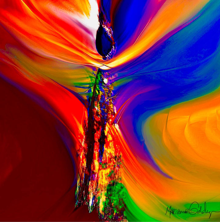
My art explores the vibrant interplay of dynamic swirls of color. By using abstract forms and bold hues I convey a sense of movement and energy embodying the spirit of my ancestors. Each brushstroke is a step in a dance, a rhythm that resonates with Earth’s heartbeat. Feel the pulse of the color as we dance the vibrant tapestry of life. soulchiart.com
Britt Michaelian
This painting has been infused with solar plexus healing energy of self confidence, surrounded by the energy of divine intuition, Reiki healing, unconditional love. The colors I use in my work correspond to energy centers in the body. When the colors are combined with a healing intention and the frequency of love, they are powerful for the people, pets, plants, and places where the art is displayed. brittmichaelian.art
Tommy B. McDonell
To me, nature’s colors are as spontaneous as those I paint. I feel colors. The layers of texture and color in my pieces are not just aesthetic choices; they embody my stories, emotions, and the struggles I face. My creations are an invitation to others to reflect, to feel, and to find their own stories within the colors and forms. leap4artnyc.com
Marni Spencer-Devlin
Art is more than decoration—it’s a portal to healing and transformation. Scientific research confirms what I’ve always felt: art can calm the nervous system, rewire the brain, and elevate well-being. My work uses color, texture, and form to create vibrant, intentional pieces that nourish the soul and energize any space. Whether in a home, spa, or healing center, each piece is designed to inspire joy, balance, and connection—not just visually, but emotionally and spiritually. Art transforms life. marnispencerdevlinart.com
Paul Sérusier
Paul Sérusier wrote, “Immutable principles exist in art. There is a science, namely aesthetics, that teaches them. These are the laws of harmony and color… A certain number of lines and colors constituting a harmony, can be arranged infinite ways.” He created :the Talisman” at the Pont-Aven artist’s colony while under the supervision of Gauguin.
Kari Bienert
My color field oil paintings celebrate color in a way that uplifts and inspires. Each work takes many weeks of mixing oils together to create palettes of new colors that are placed intuitively on the linen. I am fascinated by the infinite possibilities of mixing new colors and the spectrum of feelings color can convey to create harmony within and make our everyday lives make glorious sense. karibienert.com
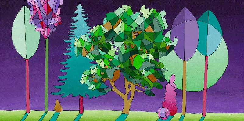
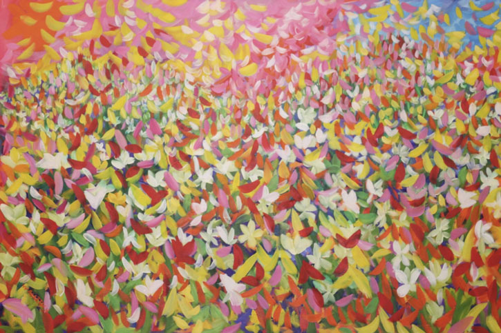
Agnes Jorgensen
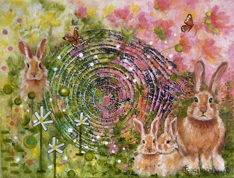
I like to think of myself as a ‘Forest Walker’ artist. The choice of colours I use helps set the mood and creates an emotional feeling. Green and pink were the 2 colours I chose for this painting. Green, at its core embodies the essence of nature itself. It is associated with interconnectedness, compassion and healing and has an uplifting power. I often use green in our ´Fallen Heroes’ project: a fundraising project which uses the rings of trees as a creative base for my artwork. Pink was used to create feelings of playfulness, comfort and warmth. To me, the color pink has a joyful vibe, where no worries exist, you are loved and comforted like being home. jorgensenart.com
Andre Chatelain
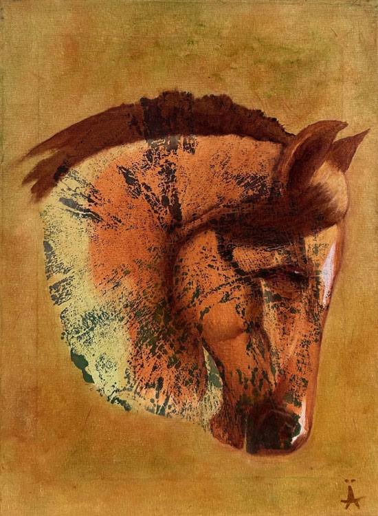
I use a limited palette of colors. I like to create my colors from the same basic tubes. My favorite has always been the burnt sienna color. It’s a warm, earthy color between red and brown. Burnt Sienna is present in all my paintings. It evokes feelings of grounding, calmness, stability, nature and humanity. This painting is part of our Fundraising project “Fallen Heroes” for Cancer Care organizations in Quebec and Manitoba. andrechatelain.com
Patricia Nah Roche
In my holistic practice, I have discovered color therapy as a potent tool for healing the mind, body, and spirit. Within my art, I instinctively choose colors that resonate uplifts my mood or aligns with the needs of my inner world. My creative process is one , where each hue complements the theme and is a reflection of the healing powers of colours be it a vibrant yellow or calming blue and greens or cleansing white. (patrochegallery.com. Currently not accessible)
More Artists Who Contributed to Color in Art
Hilma af Klint
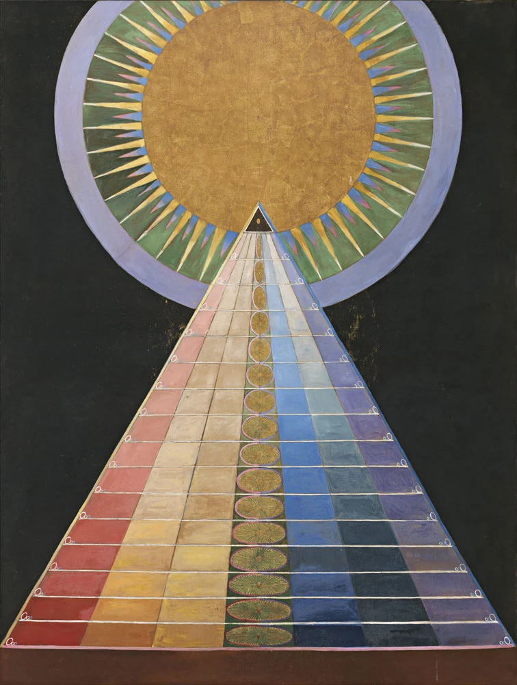
Hilma af Klint created art with colorful, biomorphic shapes, vigorous lines and intricate patterns. Her work reflects themes of duality, cosmic energies, and the connection between the spiritual and the physical worlds. Her paintings are not simply a visual representation of her ideas, but rather portals into another realm. She wrote “Art is a bridge between the visible and the invisible.”
Mark Rothko
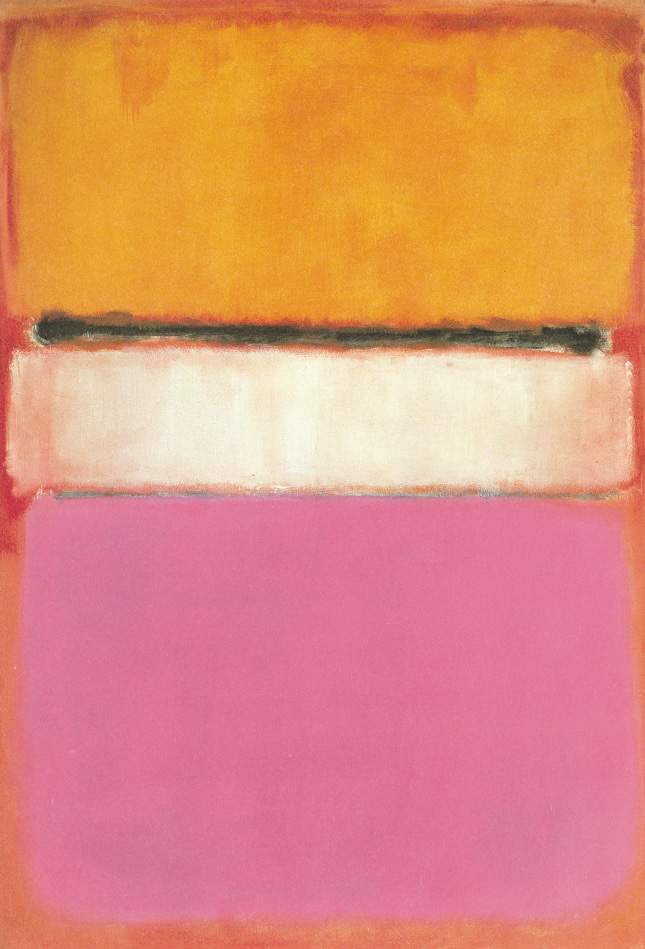
Color Field painting was a movement that emerged in the 1940’s-1950’s. It placed a new emphasis on color as a means of expression. The style of abstract painting is characterized primarily by pouring, staining, spraying, or painting large fields of flat solid thinned paint onto raw canvas to create vast chromatic expanses. In this movement color becomes the subject in itself.
Mark Rothko was a leading Color Field painter. Surprisingly, he stated “I’m not interested in the relationship of color or form or anything else. I’m interested only in expressing basic human emotions: tragedy, ecstasy, doom, and so on.”
Stanton Macdonald-Wright
In a 1916 statement on Synchromism, Macdonald-Wright described how he purified his paintings to create effects through rhythmic colour forms, explaining that “color, in order to function significantly, must be used as an abstract medium.”
Primary and Secondary Colors
Historical Facts and Healing Properties
Blue
In color therapy, blue governs the throat and the thyroid, so has an important role to play both in speech and communication, and in the body’s metabolic functions. It is associated with feelings of trust and sense of security which is why you see it associated with banks and many businesses and some police uniforms. The word ‘Ultramarine’ comes from the Latin ‘ultra’ meaning ‘beyond’ and ‘mare’ meaning ‘sea’. It is one of the oldest blue pigments. The earliest evidence of this color’s use is in 6-7th c AD and can be found in the Temples of Bamiyan, Afghanistan.
“If painting is no longer needed, it seems a pity that some of us are born into the world with such a passion for line and color.” ~ Mary Cassatt
Purple
Leonardo da Vinci preferred to meditate in a lavender or purple-colored light. Purple is associated with poetry, love, romance, and peace and is associated with all things related to the spiritual realm. The color is used in healing for its soothing properties and it stimulates the mind. The color purple also symbolizes the state of selflessness as it represents oneness with the universe.
Red
Throughout time, the color red has held special significance for cultures around the world. In the Western culture, the warm color is most commonly associated with love. In many other parts of the world, red symbolizes joy and good fortune. In many Asian countries brides wear red as a symbol of fertility and luck. In Europe it has been linked to aristocrats and the clergy.
Orange
The color orange is considered by many to be a happy, energetic and eye-catching color. In some cultures, it’s considered to be a sacred hue, while in others it’s a symbol of royalty. Since ancient times this color has had a strong impact. Orange is known for stimulating creativity and also the appetite. Orange promotes a sense of general wellness and emotional energy that should be shared.
Yellow
Yellow is the color we associate with the sun. It is the brightest color of the visible spectrum, and it is the most noticeable of all colors by the human eye. Yellow strengthens the nerves, enhances mental clarity and encourages laughter, fun, joy and hope. The color induces feelings of vitality and renewal. In healthcare, it is used to accelerate the body’s natural healing process. Art with yellow is an excellent choice in medical facilities, especially after-surgery recovery rooms.
Green
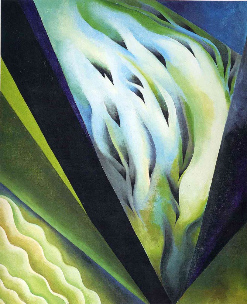
The color green generally signifies growth, harmony, health, life, spring, wealth, and many other positive qualities. Color experts agree this color provides hope more than any other colors. It is a calming color. It is the easiest color for the eyes to process. When viewing O’Keeffe’s painting we observe how different shades of light and dark green can provide drama and contrast while they also create a vaporous and soothing effect.
More Facts About Healing with Color
Chromotherapy
Several ancient cultures, including the Egyptians and Chinese, practiced chromotherapy — using colors to heal. Chromotherapy is sometimes referred to as light therapy or colourology and is still used today as a holistic or alternative treatment.
Coloring Reduces Stress!
Elena Santos wrote an article on Huffington Post that emphasizes coloring is a great way to lower our stress levels. The reason is when we are involved in this type of activity we activate different areas of our two cerebral hemispheres. She quotes psychologist Gloria Martínez Ayala: “The action involves both logic, by which we color forms, and creativity, when mixing and matching colors. This incorporates the areas of the cerebral cortex involved in vision and fine motor skills [coordination necessary to make small, precise movements]. The relaxation that it provides lowers the activity of the amygdala, a basic part of our brain involved in controlling emotion that is affected by stress.”
Color in Design
In the design world, we can observe how marketing and branding experts spend vast amounts of money and time in using color psychology to influence your emotions and perceptions of their products and services. The color blue is used by services to evoke our trust while the color green is abundant in natural, eco-friendly, organic products. Website designers make use of the laws of color combinations when creating websites for their clients.
Congratulations Renee!
You’ve done it again! Another spectacular exhibition packed with a wide variety of styles, subjects, and creative color choices. Renee, I love that you ask the artists to write a statement about their inspiration and use of color, that you include master artists and facts about colors in art and healing. You are providing a learning experience for the artists and your viewers.
You go beyond the curatorial norm. It is clear you spend a lot of time and attention on curating your exhibitions.
There is so much to enjoy here. I will definitely revisit and share the link with others.
Congratulations to all the artists!
Thank you Mark! It’s wonderful that you accepted my invitation to view the exhibition. I appreciate you kind remarks. Thank you for planning to revisit and for sharing this exhibition with others.