
For this article I spent hundreds of exhilarating hours over the years doing research and compiling information. It contains dozens of facts about the power of color.
The power of color is inescapable. Color affects your behavior, moods, and thoughts. Your reactions to colors are often deeply personal and rooted in your own experiences. A certain color has the ability to soothe your frazzled nerves, agitate a hostile adversary, motivate and empower you to take action, and also to bring healing energy when you need it.
As Wassily Kandinsky proclaimed, “Color provokes a psychic vibration. Color hides a power still unknown but real, which acts on every part of the human body.”
Mastering Color is Not an Easy Task
The best artists have spent immeasurable time on how to master the use of color. There are numerous aspects to learn in terms of light and value, mixing processes, and painting techniques. It is not an easy task. These artists know that their decisions and uses of color can produce a successful work of art with accuracy, harmony and balance or produce a huge failure.
Chromotherapy – Healing with Color
Several ancient cultures, including the Egyptians and Chinese, practiced chromotherapy — using colors to heal. Chromotherapy is sometimes referred to as light therapy or colourology and is still used today as a holistic or alternative treatment.
Using Colors to Raise Awareness
Color is a powerful tool used by organizations for campaign messages.
For example, the Alzheimer’s Association launched a campaign asking us to wear and display the color purple to bring attention to Alzheimer’s and Brain Awareness month. We also think of purple in association with the Purple Heart which is awarded to American soldiers wounded or killed in war. Pink is the color associated with Breast Cancer Awareness, while white signifies Domestic Violence. Red is the chosen color to raise awareness about Heart Disease, and the color yellow stands for Americans supporting our troops.
Color in Design
In the design world, we can observe how marketing and branding experts spend vast amounts of money and time in using color psychology to influence your emotions and perceptions of their products and services. The color blue is used by services to evoke our trust while the color green is abundant in natural, eco-friendly, organic products. Website designers make use of the laws of color combinations when creating websites for their clients.
When selecting art for hospitals any works that have a predominance of the color red are avoided because of its association with blood. Not surprisingly, the color red and dark dismal colors, especially black, are avoided in psychiatric units.
The History of Color Theory
In 1666, English scientist Sir Isaac Newton — the one who formulated the laws of motion and universal gravitation and many other things — built the first practical reflecting telescope and developed a theory of color based on the observation that when pure white light passes through a prism, it separates into all of the visible colors. He also discovered that each color is made up of a single wavelength and cannot be separated any further into other colors.
In the 1700’s Wolfgang Von Goethe suggested in his “A Theory of Color”, that color and light have subjective and emotional aspects.
The emotional responses to color vary from culture to culture. In reported surveys, such as one conducted by Mehrabian & Valdez, 1994, black, white, and warm colors are known to stimulate the strongest emotional responses across different groups.
The chemist M.E. Chevreul (1789-1889) changed the entire course of modern art with his insightful theories concerning colors psychology, perception and color harmony. The effort to devise a scientific approach to color usage was foremost in the minds of eminent physicists and chemists in the 19th century.
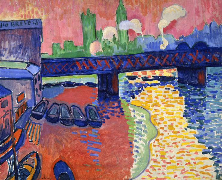
Chevreul’s book, called The Principles of Harmony and Contrast of Colors and Their Applications to the Arts, reported his extensive observations of the optical effects of colors. He developed a series of guidelines for colors psychology that could be adapted to artistic endeavors. One of his laws affirmed that when opposite colors are placed together, red and warm colors are seen a split second before green and cool colors. This causes a vibration to take place in the perception of the viewer. We know that the Impressionists used this law to produce naturalistic shimmer and movement.
The Munsell Color System
The Munsell color system specifies colors based on three properties of color: hue (basic color); value (lightness); and chroma (color intensity). It was created by Albert H. Munsell around 1913 and adopted by the United States Department of Agriculture (USDA) as the official color system for soil research in the 1930s. Researchers today still use the Munsell Color System to test how color affests us.
Little Known Facts About Color
The first known theory of color was developed by Aristotle who believed it was sent by God from heaven through celestial rays of light. He suggested that all colors came from white and black and related them to the four elements – water, air, earth, and fire. Surprisingly his beliefs on color were widely held for over 2,000 years until replaced by those of Newton.
It has been said that Leonardo da Vinci preferred to meditate in a lavender or purple-colored light.
Some 75 percent of small children choose purple over other colors.
Depending on our cultural background the significance of colors may vary significantly. While the color white is used in many Western countries to represent purity and innocence, it is seen as a symbol of mourning in many Eastern countries.
In the 1980’s, scientists found that painting jail cells with a Pepto-Bismol-like hue calmed aggressive inmates. The shade became known as “Drunk Tank Pink.”
To get the best color displayed on your LCD monitor, make sure to set it to 32-bit color. This measurement refers to color depth, which is the number of color values that can be assigned to a single pixel in an image. Color depth can range from 1 bit (black-and-white) to 32 bits (over 16.7 million colors).
How Colors Affect Us ~ A Few General Facts

Yellow, red and blue are known as “Primary” colors.
Yellow: Optimistic and youthful. When used in large quantities, however, it has been known to cause depression. You may have noticed this color attracts the attention of window shoppers.
Red: Energetic. It increases heart rate and creates a sense of emergency. This color is equated with joy and good fortune in many cultures. In many Asian countries brides wear red as a symbol of fertility and luck. In Europe it has been linked to aristocrats and the clergy. In the Catholic church the symbol of red is associated with the blood of Christ.
Art with a predominance of the color red is not considered to be a healing color and is avoided in healthcare facilities. The reasons are it is associated with the color of blood and red raises heart rate and blood pressure.
Blue: Trustworthy and sense of security. You see it associated with banks and many businesses.
Green, orange and purple are known as “Secondary” colors.
Green: Wealth and calmness. (think green grass). This is the easiest color for the eyes to process. Green is a combination of blue and yellow.
Orange: Appetite stimulant and creativity booster. It can also be aggressive and is used as a call to action — to subscribe, buy or sell. Orange is a combination of yellow and red.
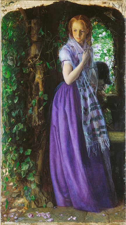
Purple: Soothing and calm. This color is found in merchandising many beauty products. Purple is a combination of blue and red.
Three other popular message-driven colors are black, white and pink.
Black: Powerful and glamorous (think “Black-tie” gala). It is used in luxury product marketing.
White: Associated with light, goodness, innocence, purity, and virginity. It is considered to be the color of perfection. White means safety, purity, and cleanliness. This color can represent a successful beginning.
Pink: Romantic and feminine. It is used for product marketing to women and girls and symbol of Breast Cancer Awareness.
A Few Quotes About Color
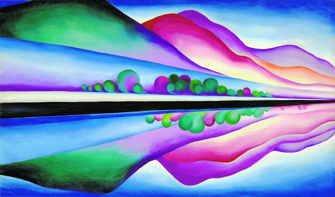
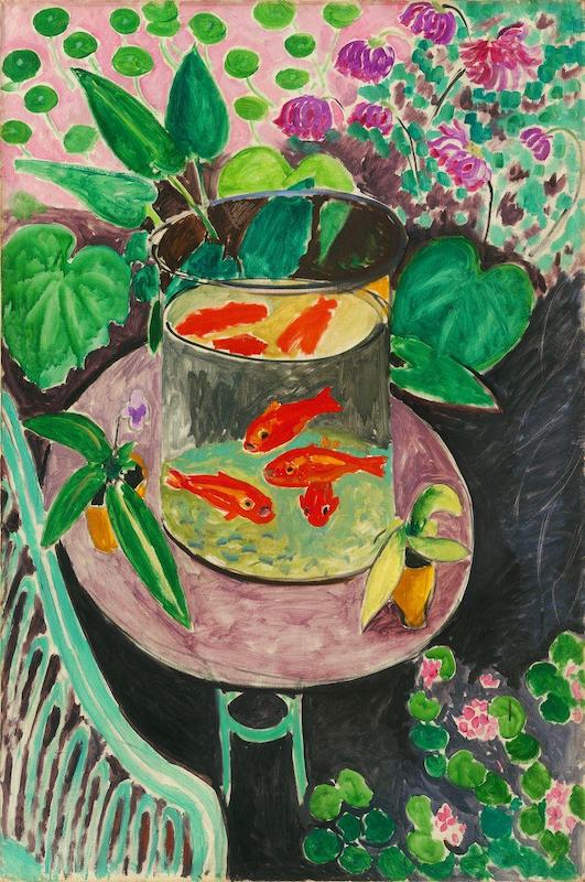
Georgia O’Keeffe revealed, “I found I could say things with colors that I could not say in any other way, things for which I had no words.”
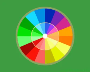
Marc Chagall’s stated, “All colors are the friends of their neighbors and the lovers of their opposites”. In other words, “Friends” are the analogous colors — those that are side by side on a 12-part color wheel. The “lovers” Chagall refers to are complementary colors — those hues that are directly opposite each other on the color wheel.
Picasso said, “Colors, like features, follow the changes of the emotions.”
Oscar Wilde quipped “Mere color, unspoiled by meaning, and unallied with definite form, can speak to the soul in a thousand different ways.”
An Increase in Births Affects Color Choices
In the past few years there has been an increase of births, motivating hospitals to expand or renovate. Also, healthcare facilities are building specific suites and departments for birthing centers and infant care. In order to promote a sense of calm for the patient, labor and delivery suites are taking a cue from a Caribbean palette. Utilizing certain colors provides patients with a spa-like environment. These tranquil tones are reminiscent of a beach vacation.
Color and how it functions is integral in the learning and development of the child’s perception of their world. Newborns to four month old infants can see high contrasting materials about 8-12” away from them. Placing a bold high contrast accent wall helps them focus on the object in front of them. Good color vision occurs around five months of age. Color has the ability to act as a positive distraction during a diaper change. Pediatricians are wise to choose calming colors in their examination rooms where they administer vaccinations.

Did you know?
In his sixty-first year, Johann Wolfgang von Goethe 1749–1832) published Theory of Colors which is available at the public library and also onAmazon.
National Pink Day is always celebrated on the 23rd of June each year.
According to Solar Thai Calendar the color pink is associated with the second day of the week.
The Pantone Institute is the global authority on color and provider of professional color standards for the design industries. Every year, the Pantone Color Institute uses color theory to interpret trends — looking at fashion, design and “socio-economic conditions” for inspiration. You can learn more on its website https://www.pantone.com
Have fun with color!
Colors offer an array of powerful and exciting options. Enjoy experimenting with new colors and combinations, whether you’re decorating your home or office, creating art work for sale, or designing your website, services and products.
Coloring Reduces Stress!
Elena Santos wrote an article on Huffington Post that emphasizes coloring is a great way to lower our stress levels. The reason is when we are involved in this type of activity we activate different areas of our two cerebral hemispheres. She quotes psychologist Gloria Martínez Ayala: “The action involves both logic, by which we color forms, and creativity, when mixing and matching colors. This incorporates the areas of the cerebral cortex involved in vision and fine motor skills [coordination necessary to make small, precise movements]. The relaxation that it provides lowers the activity of the amygdala, a basic part of our brain involved in controlling emotion that is affected by stress.”
Such a great article! I’m a nurse and am always noticing the colors of the artwork at my hospital. I also pay close attention to my choices in color for my own paintings. As much as I try to branch out with colors other than blues and greens, my heart and soul always return back to those shades as they have helped me heal from so many years working in critical care.
Thank you Nicole for sharing your knowledge and experience about the healing impact of color on hospital patients. Keep creating healing works of art!
Ahh “color” my reason for creating art! I believe we are first attracted to the colors of a painting before its images. It draws us in like a laser beam! It lifts my spirits when I am tired, sad or frustrated. No matter what art medium in which I create, it is always referenced first by my viewers with delight. Renee, it was interesting to read about the color orange as an appetite stimulant and creativity booster. I always include this into my works of art as an accent color. Renee, could I soley be responsible for my clients joining Weight Watchers! Love this article😀
As always, you’re right on point. Except for one thing: Don’t blame yourself for your collectors gaining weight. Instead, sell your art to restaurants, cafes, and bakeries!
“Food” for thought! lol!
Very interesting article, if I can add something of mine own experience it would be that “ any color changes in perception as the color or colors adjacent to it change”. A specific blue will appear different next to a yellow or next to green or red or any other color, as if the colors in the space between our eyes and the canvas, in that space filled with the substance of air, intermixing, subtly change.
Thank you
Dear Hariclia, Yes, thank you for pointing out another amazing fact about color! You are definitely an expert on the subject and I’m a big fan of your art.
I just love this article. Colors have the power. Thank you.
HI RENEE, I LOVED THIS ARTICLE ON COLOR. COLOR REALLY CAN MAKE ME HAPPY OR SAD. I HAVE LOTS OF YELLOW ON MY PAINTINGS. YOUR BLOG IS AN INSPIRATION TO ME AND MY PAINTING, DRAWING, AND QUILTING. SINCERELY, PAT MIODONSKI
Thank you Pat! I’m very happy to know that The Healing Power of ART & ARTISTS brings you pleasure and inspiration.